flow_cc_0522 iosflow_low_1000_v2
逻辑功能 0.626
草图 72% · 合同 25% · 运行错误 0 · 桶 19✅/10🕳/0💥
布局 0.846
断言 91% · quality 60% · 覆盖 4/4 · 下界 0.846
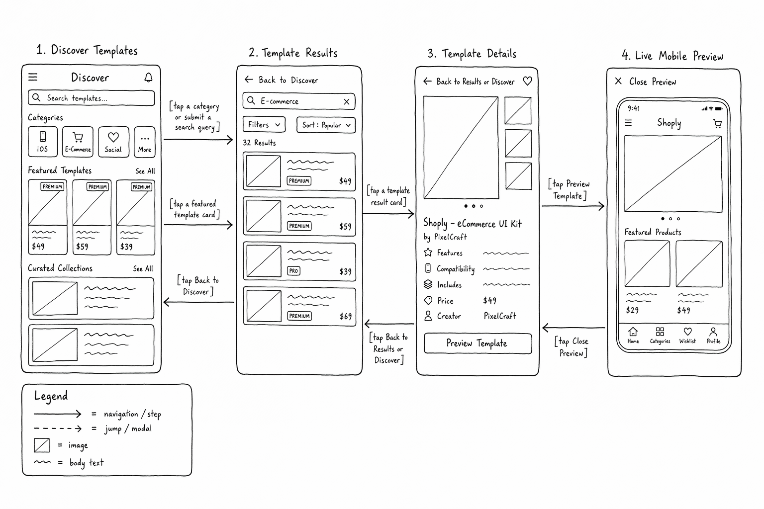
草图(点开原图)
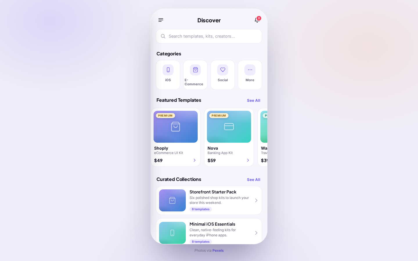
产物入口屏(点开可交互网页)
逻辑功能检查(29 条 · ✅通过 🕳未实现 💥运行失败)
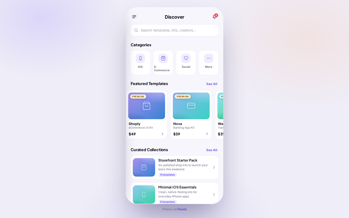
| ✅ S✓D– | sketchscreenDiscover Templates |
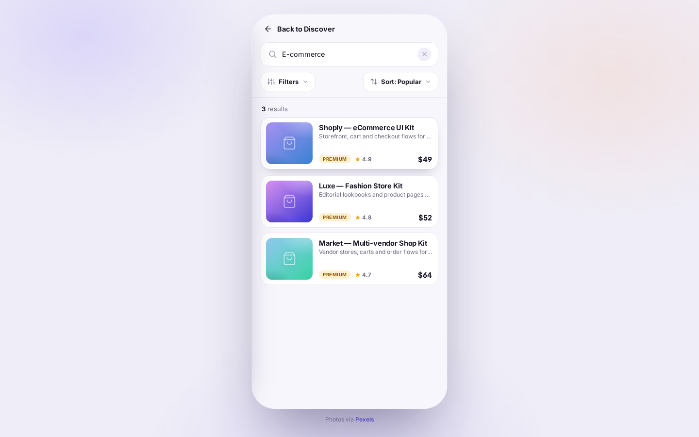
| ✅ S✓D– | sketchscreenTemplate Results |
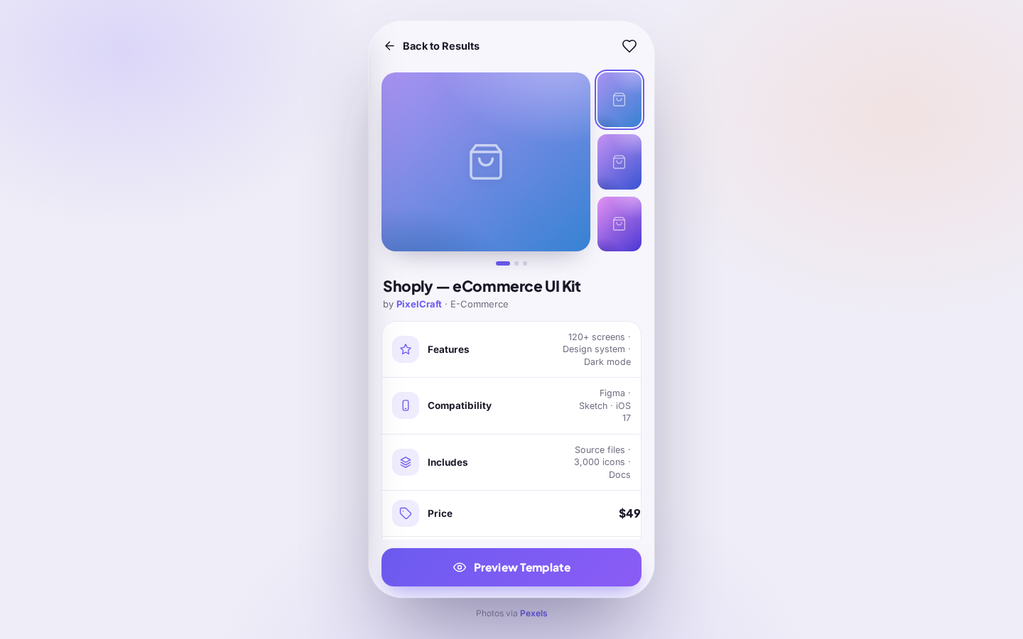
| ✅ S✓D– | sketchscreenTemplate Details |
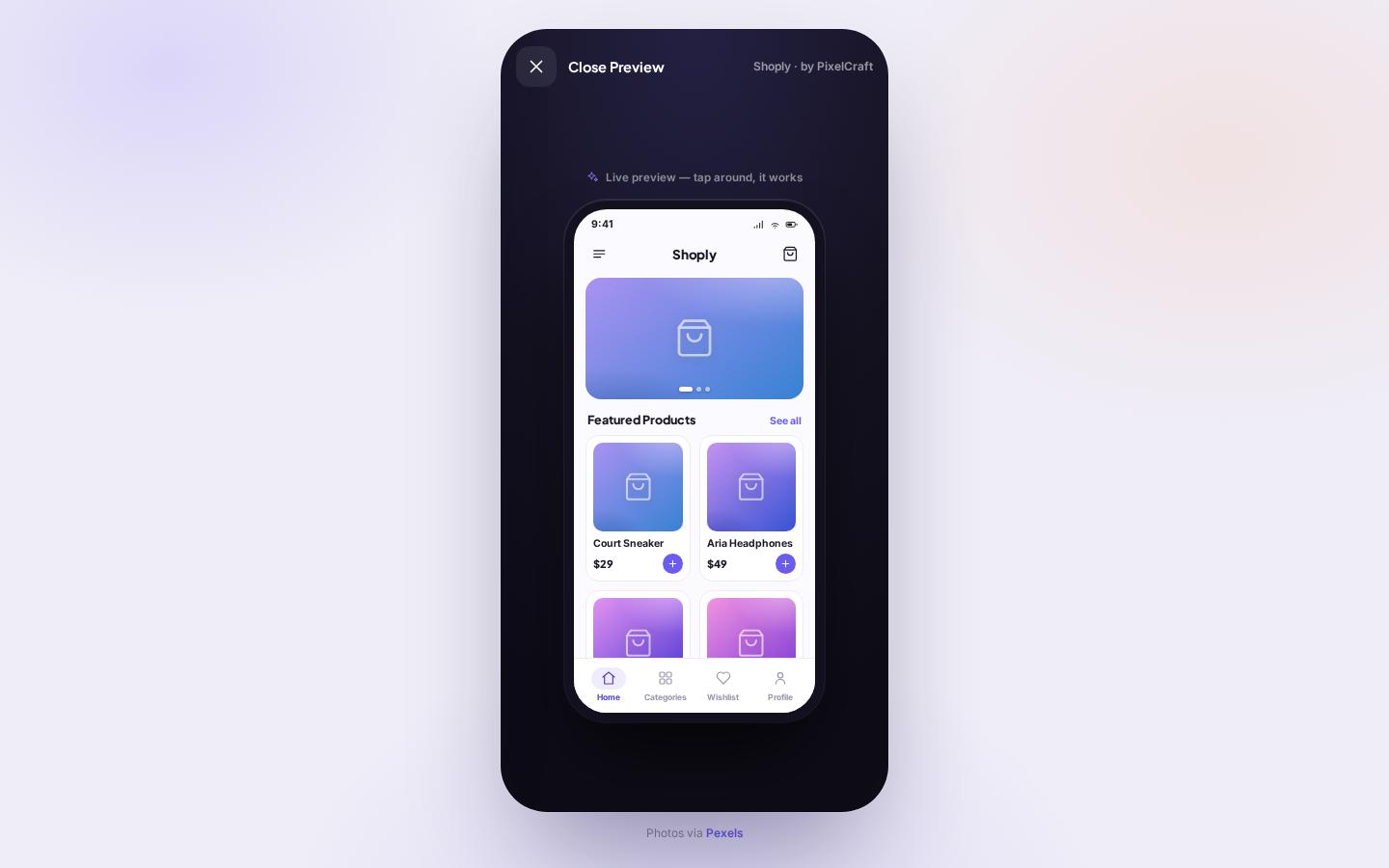
| ✅ S✓D– | sketchscreenLive Mobile Preview |
| ✅ S✓D– | sketchcomponentDiscover header with hamburger menu and notification icon |
| ✅ S✓D– | sketchcomponentTemplate search input |
| 🕳 S✗D– | sketchcomponentCategory tile row Category controls are hardcoded HTML rather than rendered from category data: |
| 🕳 S✗D– | sketchcomponentFeatured templates card row with See All control Featured cards are generated, but their click handler opens Results instead of Details: const t = byId(el.dataset.id); openResults(t.cat); |
| 🕳 S✗D– | sketchcomponentCurated Collections list with See All control The list is rendered, but its See All control navigates to Results instead of giving the required lightweight acknowledgment: $('#collAll').addEventListener('click', () => openResults('')); |
| ✅ S✓D– | sketchcomponentResults header with Back to Discover control and populated search field |
| ✅ S✓D– | sketchcomponentResults filter and sort controls with results count |
| ✅ S✓D– | sketchcomponentTemplate results card list |
| 🕳 S✗D– | sketchcomponentTemplate Details header with back control and wishlist icon Wishlist toggles correctly, but entry context is not recorded: openDetails unconditionally executes push('results'), so back cannot restore Discover according to entry context. |
| ✅ S✓D– | sketchcomponentTemplate image gallery with large image, thumbnails, and pagination indicators |
| ✅ S✓D– | sketchcomponentTemplate information panel |
| ✅ S✓D– | sketchcomponentPreview Template button |
| ✅ S✓D– | sketchcomponentLive Mobile Preview close control |
| 🕳 S✗D– | sketchcomponentPhone-framed storefront preview The phone structure exists, but some drawn controls are dead, such as |
| ✅ S✓D– | sketchinteractionCategory or search submission opens Template Results |
| 🕳 S✗D– | sketchinteractionFeatured template card opens Template Details Featured-card handlers call openResults(t.cat), not openDetails(el.dataset.id): const t = byId(el.dataset.id); openResults(t.cat); |
| ✅ S✓D– | sketchinteractionBack to Discover |
| ✅ S✓D– | sketchinteractionTemplate result card opens Template Details |
| 🕳 S✗D– | sketchinteractionBack to Results or Discover openDetails always calls push('results'); it does not record whether entry was from Results or Discover. |
| ✅ S✓D– | sketchinteractionPreview Template opens Live Mobile Preview |
| ✅ S✓D– | sketchinteractionClose Preview returns to Template Details |
| 🕳 S✗D– | contractcontractdata-driven-lists Result cards pass distinct data-id values to openDetails, but featured cards instead call openResults(t.cat), so both lists do not satisfy the required detail-open contract. |
| 🕳 S✗D– | contractcontracthonest-out-of-scope Undrawn controls are not consistently acknowledged: collection See All calls openResults(''), and phone-preview Menu/See all/profile menu controls have no acknowledgment handlers. |
| 🕳 S✗D– | contractcontractno-invented-features Additional undrawn flows and states are implemented, including drawer destinations "All Templates" and "Wishlist", preview Categories/Wishlist/Profile panels, demo cart state, Settings, and Payments controls. |
| ✅ S✓D– | contractcontractno-runtime-errors |
布局断言(43 条 · ❔=该屏截图未验证)
| ✅ C✓V✓ | Discover TemplatesorderThe header is the topmost band inside the screen. |
| ✅ C✓V✓ | Discover TemplatespositionThe hamburger is on the left, Discover is centered, and the notification icon is on the right. |
| ✅ C✓V✓ | Discover TemplatesorderThe search field appears directly below the header and above Categories. |
| ✅ C✓V✓ | Discover TemplatesgroupingThe Categories section contains one horizontal row of ~4 category tiles. |
| ✅ C✓V✓ | Discover TemplatesorderFeatured Templates is below the category row. |
| ✅ C✓V✓ | Discover TemplatesgroupingThe Featured Templates section presents ~3 cards side by side in one row. |
| ✅ C✓V✓ | Discover TemplatesgroupingEach featured card stacks an image above body text and a price. |
| ✅ C✓V✓ | Discover TemplatesorderCurated Collections appears below the Featured Templates row. |
| ✅ C✓V✓ | Discover TemplatesgroupingCurated Collections contains a vertical list of ~2 wide cards. |
| ✅ C✓V✓ | Discover TemplatespositionEach curated collection card places an image on the left and body text on the right. |
| ✅ C✓V✓ | Template ResultsorderBack to Discover is the topmost control inside the screen. |
| ✅ C✓V✓ | Template ResultsorderThe E-Commerce search field is below Back to Discover. |
| ✅ C✓V✓ | Template ResultsspanThe search field spans nearly the full content width. |
| ✅ C✓V✓ | Template ResultsorderFilters and Sort: Popular appear together below the search field. |
| ✅ C✓V✓ | Template ResultspositionFilters is on the left and Sort: Popular is on the right. |
| 🕳 C✗V✗ | Template Resultsorder32 Results appears below the controls and above the result cards. No static “32 Results” exists. The count is generated from the actual list length: `const n = list.length; $('#resCount').innerHTML = ...`, and the source contains only 14 templates. |
| ✅ C✓V✓ | Template ResultsgroupingApproximately four result cards are stacked vertically in a single column. |
| ✅ C✓V✓ | Template ResultspositionEach result card places its thumbnail on the left of its descriptive content. |
| ✅ C✓V✓ | Template ResultspositionEach result card places its price at the far right. |
| ✅ C✓V✓ | Template ResultsspanThe result cards share a common wide card width within the content column. |
| ✅ C✓V✓ | Template DetailspositionBack to Results or Discover is at the upper left and the favorite icon is at the upper right. |
| ✅ C✓V✓ | Template DetailsorderThe image gallery appears below the top controls. |
| ✅ C✓V✓ | Template DetailspositionThe large preview is on the left and the thumbnail strip is on the right. |
| ✅ C✓V✓ | Template DetailsproportionThe main preview is substantially larger than each thumbnail. |
| ✅ C✓V✓ | Template DetailsgroupingApproximately three thumbnails are stacked vertically in one column. |
| ✅ C✓V✓ | Template DetailsorderPagination dots sit below the large preview image. |
| ✅ C✓V✓ | Template DetailsorderThe template title and creator byline appear below the gallery. |
| 💥 C✓V✗ | Template DetailsgroupingFeatures, Compatibility, Includes, Price, and Creator form a vertical metadata list. The vertical list contains Features, Compatibility, Includes, and Price, but no Creator row. |
| ✅ C✓V✓ | Template DetailspositionEach metadata value appears to the right of its icon and label. |
| ✅ C✓V✓ | Template DetailsorderThe Preview Template button appears below the metadata list at the bottom of the content. |
| ✅ C✓V✓ | Template DetailsspanThe Preview Template button spans nearly the full content width. |
| ✅ C✓V✓ | Live Mobile PrevieworderClose Preview is the topmost control in the preview screen. |
| ✅ C✓V✓ | Live Mobile PrevieworderThe phone frame appears below Close Preview. |
| ✅ C✓V✓ | Live Mobile PreviewpositionThe phone frame is centered within the outer preview area. |
| ✅ C✓V✓ | Live Mobile PreviewpositionInside the phone, the menu is on the left, Shoply is centered, and the cart is on the right. |
| ✅ C✓V✓ | Live Mobile PrevieworderA large hero image appears below the phone's app header. |
| ✅ C✓V✓ | Live Mobile PreviewspanThe hero image spans nearly the full width of the phone content area. |
| 🕳 C✗V✓ | Live Mobile PrevieworderPagination dots appear directly below the hero image. The dots are overlaid inside the hero rather than below it: `.pdots{position:absolute;bottom:8px;left:0;right:0}` and are appended within `#pHero`. |
| ✅ C✓V✓ | Live Mobile PrevieworderFeatured Products appears below the pagination dots. |
| 🕳 C✗V✓ | Live Mobile PreviewgroupingFeatured Products contains a two-column row of ~2 product cards. Although `.pgrid{display:grid;grid-template-columns:1fr 1fr}`, `t.pv.items.map(...)` renders four items for each template, producing two rows rather than one row of about two cards. |
| ✅ C✓V✓ | Live Mobile PreviewgroupingEach product card stacks an image above body text and a price. |
| ✅ C✓V✓ | Live Mobile PrevieworderThe Home, Categories, Wishlist, and Profile navigation row is the lowest band inside the phone. |
| ✅ C✓V✓ | Live Mobile PreviewgroupingThe bottom navigation contains four horizontally arranged destinations. |
合理性 quality(5 条固定)
| 💥 | q-overlap No overlapping, clipped, or colliding elements; no text overflowing its box. Screen 4 (live preview): the fixed bottom navigation overlaps and clips the lower row of product cards. |
| ✅ | q-media No broken images or empty gray media slots where the sketch draws a photo. |
| ✅ | q-align Grids and lists are cleanly aligned: uniform card sizes, consistent gutters and |
| ✅ | q-readable All visible text is readable: sufficient contrast and size, no truncated labels. |
| 💥 | q-obstruction Docked bars/overlays do not unintentionally cover content in its resting state. Screen 4 (live preview): the docked bottom navigation bar covers the lower product-card row in the resting state. |
逐屏截图(布局评测导航所得)